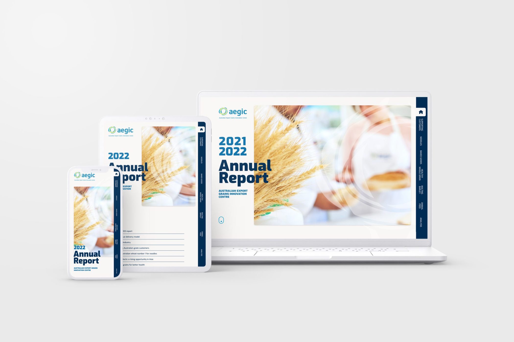
Bring your annual report into the modern age with a tailored microsite

When annual report time starts to loom, one of the big questions is how to publish it.
These days, the majority of annual reports are purely digital, viewed solely online. But rather than simply default to a PDF report, it’s important to choose a report format that delivers the optimal viewing experience and interactivity that modern users need.
You need the power of a microsite.
Developing a microsite for your annual report has some huge benefits when compared to a more traditional PDF, while providing an avenue to deliver more information to a larger audience in a more engaging way.
1. Deliver your information faster
A microsite provides a faster, more intuitive way to search for information in your report. Instead of trying to scroll through seemingly endless PDF pages, your audience can navigate exactly to the page they want through the easy menu options.
2. Provide more accessible information
Creating a microsite for your reports ensures you’re meeting WCAG 2.1 standards.
- It’s easier to read, and compatible with text-to-speech alternatives
- It’s easier to use and navigate, meaning your information is easier to find
- It also ensures compatibility with future assistive technologies
As well as accessibility, publishing a microsite for your annual report makes for easier reading on mobile. And let’s be honest, this is where many of us do most of our reading.
3. Reach the right audience
These days your shareholders are all online, and everyone expects to read business content on a website. So delivering your annual report in a microsite format ensures your audience can access your report in the way that they read it.
It also improves engagement, as microsites are infinitely shareable. You and your readers can publish the link via email, across social media, or add it to your website, or a blog post. It even makes individual pages shareable, directing readers to key statistics or information with a simple page link.
You can’t do that easily with a PDF.

Digital marketing agency Melbourne
4. Improve your oversight
A PDF report lets you see how many people have downloaded the report—but that’s where your oversight ends.
Migrating your annual reports to a microsite provides the ability to track your metrics much, much better. You can track your analytics, see who’s clicking on the site, what they read, and how long they stay there. You gain valuable insight over its performance which you can use to improve on in years to come.
Create a tailored microsite for your next annual report
Your annual report is a legal obligation—but this doesn’t mean it has to be boring. Creating a microsite for your report provides an eye-catching, engaging, and accurate way to deliver the information you need, in a way that people actually want to read.
Blockbox Design is an experienced annual report design agency in Perth and Melbourne, and we’re here to help you make this year’s annual report a success. Get in touch with us to start planning an impactful microsite for your annual report.
Read More
How to compile your content for a streamlined process (and keeping your design agency on your side)
Related Articles
-
How Blackbox Design can take the stress out of annual report season
We know how stressful report season can be. The responsibilities of compiling the right information, delivering it in the right way, and publishing it on time all merge to create ...
More -
How to compile your content for a streamlined process (and keeping your design agency on your side)
When supplying content to your graphic designer, a little bit of forethought can make the process immensely easier. Here are our top tips when compiling your content for supply to ...
More -
The Essential Web Design Elements For Real Estate
The realtor's challenge is to portray a house like a future home for a home buyer. In the past, property buyers would have to travel to places and view them. ...
More -
Corporate Website Design Ideas
Websites have replaced stores and buildings as the faces of businesses. This shift in perspective means your website should be attractive and functional, which helps to pull clients. Think of ...
More


